

Add Comment
Street art : des jeunes graffeurs mis à l'œuvre pour le festival Colors urban art • France 3 Grand Est
Colors TV Launches ‘Lakshmi Narayan’, Show in Delhi Featuring Goddess Laxmi and Lord Vishnu • ONE100 NEWS
Moto looks 🥵🥵 amazing colours • Vish tech
Stand Out Colour Me Pretty | Shimmer | Iridescent | Multi Chrome | Colour Changing Nail Polish • Stand Out


The colors, always present in our lives, have not only a decorative purpose, in fact, it has a strong communicative function and can reach a strong influence on our state of mind.
But really, what are colors? They are the visual perception in response to the different wavelengths of light radiation. On the retina we find the cones and rods, that is our photoreceptors. The cones are responsible for the vision of colors and there are three types. Some are dedicated to the wavelengths of blue-violet, others to those of green and the last to red-orange. All the other colors are the result of the overlapping of the chromatic effects. Then, through the neuronal network, the stimuli pass from the cones to the brain, where they are processed together with other environmental information, up to the chromatic sensation.
A lot of scientific disciplines are involved in their study, including physics, chemistry, mathematics, psychology, neurobiology, philosophy. There are other disciplines, not officially recognized as sciences, that treat the subject from other points of view, such as chromology and chromotherapy.
THE PSYCHOLOGY OF COLORS
It is the study of the psychic reactions and emotions that people present in the presence of certain colors. It is widely believed that it is a pseudoscience because the color is very related to the personal taste and experiences of each individual. However, even this last aspect, so subjective, is extremely revealing for research purposes and, in some ways, confirms the psychological symbology of color.
In this regard, it’s interesting the work of Eva Heller, psychologist, sociologist and professor in communication theory. Her study, based on an inquiry involving 2000 people, shows that colors and feelings do not bind accidentally. So, it’s not just personal taste. On the contrary, the meaning of color finds roots in early childhood and remains internalized so deeply as to seem innate.
It is understandable that, despite numerous studies on the subject, it is still seen with a certain diffidence because the reference to subjectivity and symbolism remains strong.
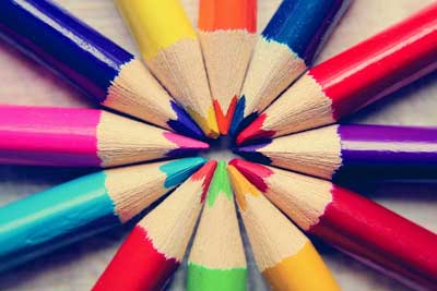
THE MAIN COLORS
In the experience of each of us, it is reasonable to say that there are colors that are winning but it’s important to remember that the meaning and interpretation of color can be very different in other cultures and communities. Let’s see some of the most used, in reference to European and American culture.
BLUE
It’s a color that represents harmony, peace and balance. Used in most advertising campaigns and the creation of commercial environments as it transmits reliability and seriousness, without ever being excessive or heavy. Without any doubt, it is a winning color, suitable for any context and easy to use.
RED
It represents the energy, the love, the passion and the impulsivity. It’s a strongly ambivalent color because its excessive use is associated with blood and violence, calling in the observer negative feelings. The red is quite used in the marketing to attract attention, even if in some cases it is too invasive and aggressive.
YELLOW
It’s the color of the sun, it symbolizes light and creativity. It’s associated with the will to do, joy and youth. Being a very bright color, used too can tire the view of the observer. Also in some of its tonality' is' associated with ambiguity.
LILAC AND VIOLET
It is the color of magic, of spirituality, and the occult, with a strong reference to femininity. It’s the result of the union between the energy and impetuosity of red and the calm and balance of blue. It’s associated with the concepts of metamorphosis, transition, and simultaneously with prudence and moderation. It’s a much-loved color by a large part of the female audience, of any age, and that’s why it’s one of the most used in the cosmetics and make-up industry.
GREEN
It is a color with a very positive meaning and it is the color that par excellence recalls nature. Often associated with health and healing, it relaxes and inspires confidence in the interlocutor. It’s used a lot, for this reason, in those environments where it’s necessary to create an atmosphere of familiarity.
It is also very often used to evoke the idea of the abundance of money and fortune.
ORANGE
This color comes from the combination of the energy of red with the joy of yellow. In marketing, it is often used for products and services dedicated to a young audience because it is associated with sociality, cheerfulness and vitality. It is an excellent color in those spaces where people are welcomed, such as entrances and meeting rooms, because it stimulates dialogue and awakens attention without being aggressive. Another peculiarity of his is that of having the ability to stimulate the appetite and for this reason he is very used, with a great variety of shades, in many restaurants.
WHITE
White is the combination of all the colors of the electromagnetic spectrum, it is in fact also called non-color but has the characteristic of having a high brightness. It’s the color symbol of purity, of virginity. It is also associated with hygiene and perfection. For this characteristic, it is very used in all those environments that need to convey a feeling of cleanliness, such as a restaurant kitchen or a medical clinic. It is also the perfect ally in painting of walls, both domestic and commercial environments, as it makes the spaces brighter and wider.
BLACK
Represents the absence of color and it has always a negative connotation because of its physical characteristic of "capturing light". It is often associated with death and evil. It’s also the symbol of power and authoritarianism. On the contrary, in marketing, it does not lead to negative feelings. It is often used for expensive and luxury products, such as technology, automotive and clothing because it evokes sophistication and elegance. As opposed to white, used in the painting of walls will make the spaces visually smaller. Despite this ambiguity, it is a very popular color and much appreciated in many areas because, if well used, it becomes the perfect ally to enhance objects, environments and personality.
GREY
It’s a color that calls to immobility and monotony but also sadness and melancholy. It’s an emotionless color, detached and undecided. The latest sociological research has shown that it is much appreciated by the younger audience, despite its lack of personality, because it calls to modernity. Often those who use it do not want to create stimuli or transmit messages but neutrality or those seeking relief from a chaotic world.
PINK
It’s commonly associated with femininity, childhood, and tenderness. It’s a color with a strong positive connotation, in fact, it’s been shown to evoke calm and reduce feelings of anger, aggression and revenge. It is widely used in the advertising and packaging of products dedicated to children and women. These characteristics make it an ideal choice in wall painting, but it should be used with caution in working environments because it may be too strong the call to femininity.
BROWN
It’s a warm color and it’s associated with the idea of earth, autumn and wood. It indicates stability, concreteness, solidity and order. It also can arouse in the observer a strong feeling of genuineness. This last feature has made it a winning color for food packaging, especially those ecological. If well used, brown can give the atmosphere a very unique and welcoming shade.
And yet, it’s been proven by recent studies that it’s the least popular color in the world, in fact for many it’s a color that evokes avarice and dirt.
Those described are just some of the existing colors, they are the ones that are more present around us. Let us now look specifically at the areas in which its influence can be most appreciated.
VISUAL ART
Painting, cinema and photography are the areas that for excellence have made the color a real messenger. Thanks to it, in fact, the artists have transmitted social messages and not. Also studying the colors of a work is easy to understand some nuances of the personality and character of the author.
In painting, Kandinsky's abstractionism is a perfect example. According to this current, art does not need real subjects because it is the only color capable of provoking emotions in the observer. The color then has the upper hand on the forms.
The same happens in cinema and photography. The choice of the dominant colors and their combination is very important in transmitting psychological and emotional effects.
NEUROMARKETING
It consists of the study of the cognitive aspects of the consumer and of all those processes and factors that can influence the decisions in the purchasing processes. It can be of great help in the advertising campaigns, in the positioning and the improvement of a product or the creation of a brand or a new store.
90% of consumers say they recognize a brand because of its color. This is explained by the fact that the visual stimulus is the first approach that you have with a brand or a product.
If you want to attract a female audience you will choose shades of pink or purple.
If instead, you want to attract a high-class audience will dominate the shades of black and grey.
Another example is the use of red, the color par excellence of passion and love, in Valentine’s Day campaigns.
POLITICS
This area was not insensitive to the power of color. The color scheme chosen is the first thing we notice in the logo of a political party or in the flyer of a representative.
If you want to convey a feeling of firmness you will use colors such as orange or red. If the target is female, purple can be a good ally. Avoid pink in this case, because it would be too strong and invasive.
Another color that has a strong negative connotation in politics is black because historically it is associated with authoritarianism and anarchism.
This so-called "political marketing" is used not only in the creation of different logos or flags but also in the clothing of representatives.
If, for example, we look at the current German Chancellor, Angela Merkel, we see how often she uses, on institutional occasions that require negotiation skills, the green color, which indicates security, perseverance and balance.
Color is fundamental in the construction of a political image.
CLOTHES AND ACCESSORIES
What we wear speaks of us and our state of mind, so the conscious use of color in clothing can become a weapon at our disposal to enhance and to emerge, both in the private and in the workplace. In fact, it’s proven that the choice of colors, for example in a job interview, can really make a difference. The more the message we send is in line with the place offered, the more the chances of a positive outcome will be.
If the firm is looking for a young and dynamic profile, presenting itself to the recruiter in a grey or brown dress is not a winning choice.
Even outside the workplace, the color of clothing can reflect our mood at a particular moment. For example, dressing completely in black gives a touch of mystery and charm but at the same time does not invite dialogue and sharing.
CHROMOTHERAPY
It’s one of the disciplines of alternative medicine and it’s not considered a real therapy. It is based on the belief that some colored lights or environments of certain colors can cure certain diseases.
The operation is simple. You can use colored light directly projected on a certain part of the body or you can apply the colors chosen on white walls. Those who practice the discipline say that with daily sessions of thirty minutes about the first results are visible after a few weeks.
Currently, chromotherapy is classified as pseudo therapy because of the lack of scientific evidence that confirms its effectiveness.
There is no doubt that color can help in some disorders, such as anxiety or panic, but there have been no reported cases of genuine healing.
In other words, always considering the peculiarity of each case, it could be a useful palliative to accompany the therapies of classical medicine.
For various reasons, the psychology of colors is viewed with suspicion and distrust by other fields of study. This happens because it lacks the support of scientific evidence of its effectiveness, in fact, many of its claims are based on empirical studies not always repeatable.
On the contrary, it is strongly present in the influence of personal taste and culture. The chromatic choices of each depend inevitably also on environmental factors but it is undeniable that within a group or community, there are common answers.
If we take the white color, for example, in the West it has positive connotations, while in some Eastern countries it is a strongly negative color because it is associated with death and mourning.
And there are really many possible examples where certain colors have opposite meanings depending on the culture of reference.
The psychology of colors takes this aspect into account in its studies. The identification of these common areas, each with its cultural peculiarities, is fundamental within this discipline.
And what do you think? Is there any color that has a particular influence on you?